
Introduction
I recently got the chance to participate in the installation and configuration of an Infoblox Reporting and Analytics server, which is an advanced Splunk-based server that integrates directly into your Infoblox Grid deployment. This Splunk-server collects and stores data and statistics regarding the different uses and trends related to the DNS, DHCP, and IPAM services of your Grid. Using all this data, you can create very useful Dashboards and reports filled with interesting key metrics and graphs.
The following is being configured on an Infoblox deployment running version 8.4.6.
Activating Report Categories
To start things off we must first enable data collection for the different kinds of data we want to collect and present, not only on our custom dashboard but also in regular reports. Navigate to Grid > Grid Manager and click the green Reporting icon. Head into the tab called Services and then click on the “pencil” to head into reporting settings. Under General, you will now find all the different Categories you can enable data collection for. Enable a category by clicking the checkmark next to it and then hit Save & Close in the bottom right.
Depending on your Infoblox version, a few of the categories are enabled by default. Each category consumes a part of your total storage for data collection and you can tweak this by changing the values in the “Index %” column. DO NOT ENABLE ALL CATEGORIES AT ONCE as it may make your deployment unstable. Activate them one by one as you go and if you think they could lead to interesting data.
Activating Fingerprint Detection
We are also going to need to activate Fingerprinting, which means that Infoblox is going to profile/classify all devices connected to the network and guess what kind of devices they are based on MAC addresses, DHCP packets parameters, and more. Fingerprinting is useful to get a sense of what kind of devices and how many of them are connected to your network and utilizing the Infoblox services.
Creating a Dashboard
If you click on the big Reporting tab in the top menu you will open up the Splunk software directly from inside Infoblox. Navigate to Dashboards and then click on the big green Create a Dashboard button in the top right.
You will need to give your dashboard a proper title (or name) of your liking and an ID, which will be used if you want to reference your dashboard in the Splunk menu, for example.
When your dashboard is created we need to populate it with content in form of panels.
Adding panels to the Dashboard
Filling your dashboard with content is where the fun starts. You do not need to worry if you are not familiar with the logic and syntax of Splunk data searches because there are quite a lot of built-in default dashboards that you easily can copy the interesting stuff from into your own dashboard and then tweak it to your liking.
Your dashboard will consist of multiple panels, each one showing the result of a search for a certain type of data for example Top 5 DNS clients or Top 5 DHCP utilized pools, and so on.
Navigate to Reporting > Dashboard and go through the list of built-in dashboards which can be imported into your own custom dashboard as panels. I am gonna start with importing the one called “DHCPv4 Range Utilization Trend” which shows the networks with DHCP pools that are about to run out of IP addresses. Scroll through the list of dashboards or search for it in the search bar at the top. Once you’ve found it, click on a dashboard to see what it looks like.
To save this dashboard as a panel on your dashboard, you must first open it up in Search, which can be done by clicking the magnifying glass (“Open in Search”) at the bottom left of the graph or table. You will now see what the panel looks like and the appearance can be changed afterward depending on what fits best, a table, a graph, or a pie chart.
In the top right corner you now have to click on Save As and then Dashboard Panel.
This dashboard/panel shows which IP networks have almost maxed out their DHCP pools in the last few days. Catching this kind of issue and correcting it before users are impacted is critical.
A window like the one below will pop up and here you can select to add the panel directly to your dashboard by selecting Existing and they scroll down to the name of your dashboard. Give the panel a name that makes sense and then click on Save.
Keep adding interesting built-in dashboards as panels on your custom dashboard and soon you will have created a very powerful page where you can follow trends, statistics, and metrics.
You can drag around your panels to rearrange the order of them and make rows and columns of them by clicking on Edit > Edit Panels in the top right corner to enter the configuration mode. To switch between different visualizations of the data, like tables, graph, pie charts, and more
You can also put in “empty” panels that just display a string of text. You can use this to organize the order and grouping of your panels and use them as headers. I’ve only found a way to do this by typing it directly into the XML-code Edit > Edit Source.
To add an empty row with just a piece of text (that’ll act as a header for the panels to come), add this to your XML code:
Which results into this “header” panel before my panels of actual data:
Data takes time!
If you very recently activated a new Report Category and tried making a panel containing data related to that category, you may find yourself running into graphs and lists saying “No data available”, but don’t worry; it may take up to 24 hours before newly activated categories for data collection actually starts being available for use since it first needs to be collected and indexed in a useful manner.
Adding your Dashboard to the menu bar
Finally, if you find yourself (and maybe your colleagues) often using your custom dashboard you add a shortcut to it on the Splunk menu bar and even make it your default dashboard if you want to, which means you will end up on it right away when you and other Infoblox users click on the Reporting tab.
Navigate to Settings > User interface.
…and then click on Navigation menus > default to get to the page below.
Here you can edit the XML file which controls how the top menu is shown. Type in the ID (in my case it’s “mycustomdashboard”) of your panel, similar to the image above and you can even add the default tag to make your users land on your custom dashboard as soon as they enter the Reporting tool. Click on the green Save button to finish.
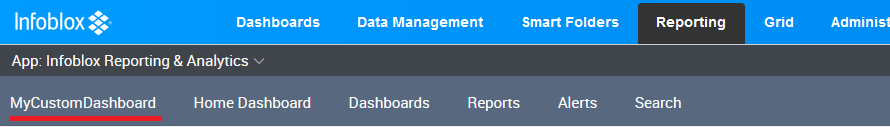
If you click on Reporting in the very top menu of Infoblox you will end up on your own dashboard right away and if you ever wanna go back to it it’ll be available in the menu, where you put it (on the first spot in my case because I put it at the top in the XML).
Example of a Dashboard
The more time you are willing to put into learning Splunk syntax and playing around with the built-in dashboards, the better your own will become. If you are looking for an example of what a somewhat useful dashboard could look like when a lot of data has been collected, head over to my Infoblox Resource page, where you can find the dashboard below. You install it by pasting the content of the XML file directly into your dashboard: navigate to the top right and click Edit > Edit Source (XML), paste it in, and hit Save..
You can also find good panels on Infoblox’s support forum where community members have uploaded quite a few very useful things.
Good luck!